by
by 
Source: Freepik
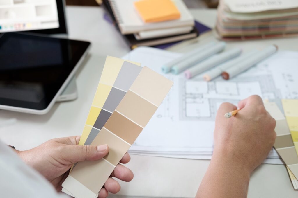
Color is not just an ornamental decision; it is a psychological instrument that determines the perception, mood, and spatial experience. The correct color scheme in the house interiors can make the small room look spacious, the gloomy room become brighter, and the neutral composition appear planned and sophisticated. In the case of rental homes, these impacts directly turn into the desirability and value. The professionals engaged in the Seattle rental property management and in many cases tend to focus more on the careful choice of colors as a way of making the property shine against the competitive listings and to generate emotional comfort without sacrificing the general attractiveness of the house, and this is the way of enhancing the total value of the rental property.
Six Color Psychology Strategies That Transform Mood and Space
Source: Freepik
- Neutral Foundations That Maximize Flexibility and Value
The professionals working in property management in the San Diego area often recommend that neutral base palettes, including warm whites, soft greiges, and light taupes, can be used to produce a flexible interior that will attract more renters, thus enhancing the total rental value of the building. The use of neutral colors creates a serene background on which the rooms can seem bigger, brighter, and more unified within the open spaces.
Such palettes are also flexible in nature, and it is simple to add accent colors using the decoration without overcrowding the space. In a market with high turnover, neutral walls minimize repainting while still maintaining a contemporary appearance.
Did you know?
San Diego’s rental market continues to trend upward, with average rents rising by nearly 6% annually in recent years.
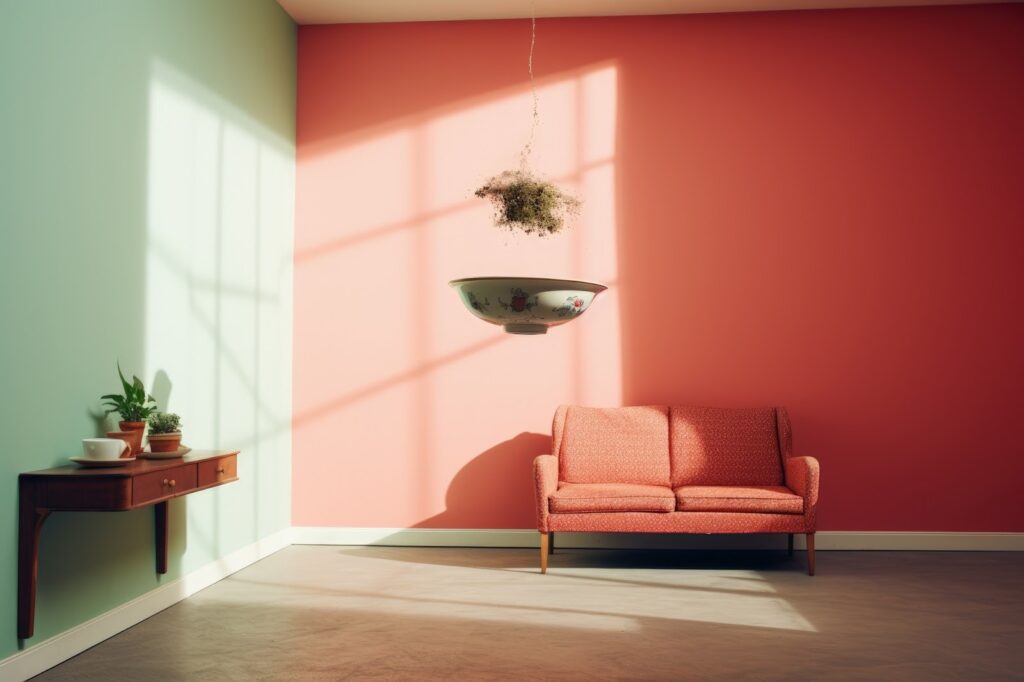
- Warm Colors That Create Comfort and Emotional Connection
The use of warm colors, including soft terracotta, dull beige, creams of honey color, and soft clay hues, contributes to the perception of friendliness and comfort. These tones stimulate a feeling of relaxation and social interaction in the living rooms and dining rooms, and make the place friendly instead of cold and indifferent.
Applied in moderation, warm colors help overcome the sterility sometimes associated with minimalist interiors. They are easy to apply to feature walls and do not limit versatility when combined with neutral surroundings. This balance is particularly successful in the rental houses, where emotional resonance is a dominant factor during the visit, and the length of stay and the perceived good attitude towards the space are the main factors.
- Cool Tones That Enhance Calm and Visual Clarity
Soft blues, sage greens, and pale grays are cool colors closely associated with calmness, concentration, and orderliness. These colors are very effective in bedrooms, bathrooms, and home offices, as they help one feel relaxed and have a clear mind.
Natural light reflects well with lighter, cooler colors, making the rooms appear bigger. They do not make them cold or cold when combined with natural materials such as wood or stone. Especially useful in urban rentals, these palettes help create the feeling of being outside the noise and activity of the outside environment, which drives measurable value and premium pricing.
Did you know?
Seattle’s rental market has shown steady momentum, with average rents increasing by approximately 4–5% year over year.
- Accent Colors That Add Personality Without Overpowering
Accent colors offer a chance to add personality while maintaining the overall impartiality. Dark navy, dark green, dark charcoal, or dark mustard can be applied in restraint by use of feature walls, cabinetry, or architectural features.
Instead of taking up the space, the accent colors lead the eye and create functional areas in the open-plan layouts. The interiors are purposeful and well-designed, achieved through this visual structure. The accents will not be used quickly, preserving the architecture’s aesthetics and ensuring the space will not become obsolete after several leasing periods.
- Light-Reflective Palettes That Expand Perceived Space
The psychology of color makes a significant contribution to spatial perception. Palettes that reflect light, off-whites, pale neutrals, and soft pastels bounce natural and artificial light throughout the room, which helps enlarge smaller parts of the room.
The slight difference between ceilings and walls literally raises the height, whereas the same color flow in the next room minimizes the visual interruption, creating openness. Such methods are particularly important in flat buildings and townhouses, where there is limited square footage. Bright, open areas are easier to photograph for listings and result in more interaction online.
- Consistent Color Flow That Creates Cohesion
The harmony and flow of the visuals and navigation within the home are enhanced by a consistent color strategy throughout the home. Instead of treating each room as a design decision in itself, effective palettes blend seamlessly across spaces, with tones that are either related or share the same undertones.
This continuity keeps the visual clutter out of the picture and makes houses seem more considered. Repetitive palettes make future updates much easier, since one can make slight modifications that will not affect the overall look and feel. In the case of rental property, the flow of colors contributes to a quality impression, which can help with better pricing and longer occupancy.
End Point
Color psychology is an effective but practical design tool that influences the experience of rental homes, memory, and perception of the home. Both neutral bases and cool undertones to tactical accents and logical flow, considerate palettes affect the mood and space, and the emotional reaction. Well-planned color strategies have a positive effect on attracting more people to rent the place faster, and a higher rental property value has been proven to follow the same pattern. The right colors do much more than just decorate a room; they define it.